Thursday 31 January 2013

I motion animation no.1


In this animation I used the actual product of golden syrup using the imotion application on the ipad software. This animation was create by myself and my friend taking images approx every 2 seconds to create the the series of photos also using time lapse which allows to take photos but in a different way. We took approximently 100 photos these images were transfered through taking th SD  card and inserting it into the computer compartment. From their I created a folder and selected the images and dragged them into Adobe Photoshop to import them.Then from this edited the timings and the scale of images to then finally save it on save as web and devices so its visible on the web.

Materials I used:
*Golden syrup
*Cutlery
*sheets of paper

I enjoyed do this animation aswell because it practical and it shows the product at its fullest pouring it,spreading etc.I t describes some of the characterstics of golden syrup on paper. I also used broken up rivita biscuits to add more to to the golden syrup from this. I added typograpghy describing golden syrup  I believe this animation worked out much more better because I had more ideas put for work working more in-depth which I believe made a successul piece also its eye catching with the different compositions shown.

However  this animation could have been more creative using more items to illustrate golden syrup.In the ned I think this animation has mostly covered the originality of golden syrup.

I motion animation


This is my I motion animation created on an IPad using the imotion application.The imotion function takes a series of photos capturing each movement creating a journey of how something was made.I set the timing for mines at 1 second which made the ipad camera take pictures of me every second to make a collection of shots hat can be played back to make an animation. Also I set the camera to manual.
However in order for this to happen I created a mind map to give me ideas on how I would approach this animation.In the mind map it included which included how,what,when would I use certain props.From this I did an example of how my outcome would be on a a separate sheet before the final animation.
Materials I used:
Graphite pencil
colouring pencil (orange)
collage of coloured card
A1 card paper

I really like my animation because its very fluent showing every action I made adding colour,drawing the outline,adding the collage to the image of golden syrup and my finishing touches.I would do this type of animation again because its interesting visually to look at.

On the other hand the only thing I dislike about my animation is that it seem s fast even though the amount of pictures that was taken was around 240+ the timings maybe was a bit to quick.
Overall I found this technique easy to do and the next time I do something like this again I would do it based on a broader subject matter maybe using of props to help me enhance the product  am animating.

Friday 25 January 2013

Animated Gif


My animation GIF

How did u create the gif?
My animated gif was made through producing a series of photos digitally.Also with capturing my with props to indicate my subject base which was drama,and my starring in the shot.From this I transferred my images to my computer via the SD card,I saved the photos on my desktop in sequenced order to create a good animated gif.This was sent to Adobe Photoshop loaded through an animated strip stack to be placed in a row to be then selected and timed from. For example: I could of chose a variety of timings 0.5,1 sec,2 secs etc,considering how I wanted each photo to be focused on and too make it look professional overall.

How effective is your animation?
I believe my animated gif is effective because I have you certain drama techniques to influence my gif.For example I have used a countdown then the action tape illustrating a type of scene like they do in movies or any play, Aswell as making and bringing in props  such as masks and cut outs from the internet.

What could you do to  improve you animation?  e.g typography,timings, try different photoshop techniques.
However I could improve my animated gift by using typography at the bottom of the screen to illustrate a story,maybe using quotes or something just made up to development. Also I could of added more photos because the timings seem a bit short like the beginning of the gift seems allot faster than expected. The lighting behind me could have been more professional like a spotlight affect which I did a shooting plan on but wasn't available.so I had to used the backlighting of the screen behind me.

Which artist did you look at for information on this technique?
The artist that influenced my gif was mainly Jamie beck which is a model in this, she has a range of gifs capturing different elements,to create a successful gif that is interesting too look at eye catching in the visual aspect e.g the scenery or the presented movement of an object of herself.

If you did this again what would you do to improve?

If I had another chance to redo this I would definitely try make the visual aspect interesting and something that people might want to download to the computers.also consider more of an creative view maybe fancy props a hat,accessories etc.Also  make more photos and choose goo timings for the whole thing,this would have more images so I could make quicker timings.


Friday 4 January 2013

Surf t-shirt evaluation


Who is your target audience? /Why did you choose thus design your t-shirt?

The target audience of my surfing t-shirt is targeted at the younger generation considering the style of my design, this is because my design includes bright bolds colours e.g. the light shade of blue on the lettering. It’s not so much a formal design embodying bold strong colours in the sense of using dull colours such as grey, black and white. So therefore I believe that my design could potentially be eye-catching to my target audience.


Which materials an techniques did you use?

For my design it started off with handrawn drawings of my own then to be enhanced from researched artists also font websites such as:  


These were my drafts of different fonts using pencil on a plain sheet of paper:


From this I began to use black fine liner to outline my design. Then I began to add colours using felt tips to then be developed on the computer using the Adobe Photoshop application that was scanned through. On the Photoshop application I used the paint bucket and zoomed into the areas I wanted to paint, also selected the type of colours using the paint selection available also following up from what my original draft on paper design I had placed.


NOTE: The rough draft above will be better to see if clicked on in order to see my annotations roughly in order to help be produce my outcome.


I believe my design is very unique and epic and its use of colour and a plain background ready t be printed onto the t-shirt base.

How could you improve your design?

On the other hand I could improve my design by targeting a general audience adding neutral colours to suit every person’s style.

Feedback:
"I like how you used  bright colours in your design"
 "Its good that you put two designs together to make your final outcome"
Which artist/designer has inspired your final piece?

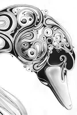
I believe Si Scott has mostly influenced my design overall this is because of the style in the font I have used also the creative side to my design in the background.
 Here are some of his works:


However for me all of Si Scotts work has influenced my design with the use of the swirly, curvy lose lines that he produces using ink, so from this I have use that in the sense of waves in the back ground of the font incorporating the surf culture as a whole aswell as the them colours I have choosen.