Monday 26 November 2012

Calligram Logo


In this photo I have produced a Calligram logo, but not finished. This is a picture of  how it was in the beginning, as a normal typography drawing black and white. I used tracing paper to the drawing would convey unto the computer via scanning. I also used pencil then to be overlaid with black fine liner with no gaps.
 Through using Photoshop I cleaned up my image this was because at first the image appeared messy with bits and pieces in the background. through a number of steps I managed to create a clear image. this was done by using the brush tool and the measuring the brush tip according to the amount of space I needed to rub out the selected the colour white for the marks to be removed.

Then I transferred my image into the Adobe illustrator application (app) to do the additional "Live Trace" this will create a new layer for my image then t be edited using the  adjustments key the to levels changing its format. From there I added the colour to my image also using the the direct selection tool and the paint pallet with different optional colour schemes. E.g "cool" for the blue contrast of colour referring to surfing waves.

Oscar Wilson t-shirt design


Oscar Wilson is a British artist who's works is mostly colourful and bright with the base of typography. Every piece of art she creates use has different subject use each time e.g travel; so she might focus on doing typography on a bus or a city. As shown below:

London bus (red,grey,white and black tints)

                                           London Bridge (dark colours grey,green faded brown etc)

Like above all of his work is precisely made with an idea or message that is shown or written on his work. Which might describe the object or the place where it is situated to reflect on his or the publics opinion of it. On the over hand she has a sustainable design for all of his work that is very unique and eye capturing with words inside of a shape of different things but yet still visible with the black background marking where the shape starts and ends it very clever.Also he might not use black, so white would be the alternative colour if wanting a colourful piece.
Outline of a person head

Architectural building outlook
For example:

From this I have captured certain aspects of his work to incorporate into mines in this case the subject matter is surfing.The typography I used in my own work is referring to surfing words e.g dude,awesome etc. these words were all fitted into a palm tree shape.Using a full spectrum co-ordination to be capturing and new for surfers to wear on the t-shirt.

I used this t-shirt as a template to base my design onto. This will give me an initial idea of what it would look like if it were to be manufactured.To create this design I used Photoshop using the move tool icon to move my design onto the t-shirt template. This was my design that was edited in Photoshop and then was transferred to Adobe Illustrator to be filled with colour. My design was made using an image from the internet drawn with pencil then traced with a black fine liner onto tracing paper to be transferred via machine.
This was my original design when it was first produced using fine liner the to be put on the computer to edited.from this I used the Adobe Illustrator to better the design instead of leaving it plain black and white. The was moved tondo my t-shirt template in the Photoshop application.


This was my finished product:


To improve my product I would of created more design or colour co-ordinations to help me on what to choose on my final product.With strong reffereal to the surfing culture.On the otherhand My design is reflecting an aspect of the surfing culture by the use of a a surfing image.also to assist this I have included surfing related words inside of the in body of the palm tree frame.Perhaps to make this design even more creative I could of considered another design to complement this one instead of the design to be alone. For example:added a background colour perhaps using a coloured t-shirt to enhance my design so it looks more wearable with my targeted audience.

Si Scott t-shirt design


Examples of Si Scotts work:

Si Scott uses typography in a different way than Oscar Wilson. Si Scott is very stylised in thee font aspect and is also very extravagant in the design field. Not only does he make colourful fonts and different curves and shaping with the font but then stretches and broadens the whole aspect typography its not just plain.

Down below is my own hand made version where I considered different aspects of Si Scotts work, where I believe I expanded on my original font to something big and new with different shapes curves swirls etc.
My design seems to be very creative using large font size adding illustration
with the leaves of some sort coming out of the lettering, Also some expression of the word, for example: where it put a flashing flashy yellow coming from the "A" for example.
 On the other hand I dislike how the colour scheme is slightly faint I would have preferred it to be more bolder to be more interesting instead of just relying on the additional artistry around the letters. Furthermore I could have used a better choice of styling around the letters instead of a simplistic approach.

Here are some of my other work pieces which were influenced by Si Scott.


Above are some ore of my designs, contributing to Si Scotts style. they were both made using Adobe Illustrator, swell as using the various tools that were provided e.g the swirl tool etc. At first i started with the normal lettering of "Awesome" which were on a black bold font. 

From there I centred the lettering in the middle of the page, then continued to use the styling tools to develop a new image and renew the original form. The compositions of the lettering were changed in the second design as I wanted to try something something more experimental. Aswell as this I added a clouded them that still referred to the surfing theme. 

From my 2 computerised design the good aspects of them are that they are visible of what the word is, the chosen edits are not disturbing the actual word, so therefore its more of an artistic approach. Also I think that the size of the font is reasonable to see, which is a good contribution to the overall design. 

On the other hand to improve my design I would try and think of my audience aim then to be considering more aspects rather than just making a design with influence but have no exact target audience to aim it to.

Outcome 1:


Outcome 2:


Linn Osbourne


MATERIALS I have used:
PHOTOGRAPHS from the internet, ADOBE PHOTOSHOP application, LAYERS, the CROP TOOL, HUE / SATURATION option

TECHNIQUES I have used: producing a PHOTOCOLLAGE T-SHIRT (INSPIRED BY LIN OSBOURNE'S)

EQUIPMENT I have used: I MAC COMPUTER, ADOBE PHOTOSHOP

 Lin Osbourne's work is very creative and imaginative as well as capturing to viewers. Linn Osbourne use lots of photographs that is then scaled into mini ones to create a collage.These pictures consist of an everyday occurrence which shows images of the natural.For example: household objects,containers, with this she highlights the importance of branding carrier bags.From this it introduces a commercial and social history.These images are then repeated to create a series making the collage.
What is her inspiration? Lin Osbourne's paintings are inspired by the works of Barbara Rae in the sense that she uses acrylic paint and collage development.Through this her photographs has renewed a feeling of uniqueness but retains the original image. The structure of this art piece is landscape, putting each shape against each other contrasting images that she likes together.Instantly it creates texture and turn people attention causing the view to be abstract.

My inspired piece:

This is my final piece that was influenced by her work.In this design I have chosen a black t-shirt as a base template to place my collage onto. my collage consists of my brighton pictures which I took on from different view points in Brighton These images are my primary except from the two images which were taken from another source.

I used the Photoshop application to create this design through a range of steps;here I have used 16 images to fill the template they are all scaled using the a grid contributing the rule of thirds located in the tools provided  e.g scale snap to grid etc.I have also added my own logo to finalise third design to state that this is "my companies" product.The reason why I have Put my logo at the bottom of the template is because when the viewers are scrolling through the photos on the t-shirt they will try to zoom in at my logo which is colourful and has a drastic change to the other images.

On the other hand I love they way my design has shown a range of snapshots that are primary not just taken from the internet this shows real independence and skill. All images where based on Brighton but contributing the surf nature.Although there are aspects of my design that I dislike; for example I wanted to select more blue and yellow images to refer to the surf culture . By using the complementary colours of blue and yellow illustrates the water an sand on the sea shore.Also with the major help of the colour collage which varies in the entire collage to present a perfect design as a whole influenced by Lin Osbourne.

So to improve my design I would have to Improve my t-shirt template because it seems quite blurry but still I can see merely the outcome of the design.Also if I had a better selection of primary images it would enhance the feel of the design

Oscar Wilson and Si Scott comparison


Here I have produced and Oscar Wilson and Si Scott influenced t-shirt design. The both generate skill of creativeness and skill, this has been shown through the use of different experimenting of materials and processes to give each outcome. They both have been illustrated with the Photoshop application which has made an addition to my design with colour and style with sophistication.

Si Scott outcomes:
Oscar Wilson outcomes:

Oscar Wilsons type of art is more of an calligram look. He puts a collection of words together that are quotations or something that is just relevant to the subject matter using the outline shape of the piece. E.g London Bridge (the quotation would involve all things to do with London; Palace,London Eye etc)With each design there is a background of a black outline or colouring with the space inside of each letter to extend each letter.Also each piece of art works seems to using the same type of bright colour co-ordination, to make his works go to the extreme.All of these things I  have tried to incorporate into my design. E.g black outline, calligram look etc in the form of a palm tree relevant to the surfing culture.

However I have made my own addition of adding my logo for my company "WAVEZ" onto the design to make it look more official.

Si Scotts type of art is a more loose typography sense of style making different shapes with the extension of lettering.Whereas Oscar Wilson style is a morte reserved one.They both show a big sense of creativity but I would prefer Oscar Wilsons type of style but worth attributes of SiScotts one e.g bright colouring. With the combination it would produce an overall great design.

What makes a good logo?


  • Good colour scheme (matching bright colours)
  • Catchy writing (bold,stylish) 
  • A goal/aim   
  • Appealing to target audience (Children,Adults) with the use of choice of colours e.g cartoon styled illustraion for kids, a bright selection of colours a sort of full spectrum of colour to attract that audience.
  • Illusion (hidden message maybe appropriate for an older audience to understand the message)
  • Pictures,illustraion,animation
  • Largde scale visible to see from any point
  • Reflects the company
  • Clear symbols
  • Muted colour scheme (for an older audience)
  • Keeping in mind suring logos tend to be playful and bright 
  •  


Sihlouette t-shirt


I have designed a silhouette of a surf related image. This was made by drawing the silhouette with fineliner to make it bold then to be filled in on the Photoshop application with the paint bucket. My design has a small scale but is still  visible.


Down below is my template t-shirt where my silouette edited image would be placed on top to complete the design. However I would improve my design by making the background clean (pure white) using the paint brush option. In the Photoshop application I have used a Brighton primary image to be placed in the background of my silhouette with a surf related writing combination. The poem chosen, was a relevant poem from Judith Wright.http://www.poemhunter.com/poem/the-surfer-2/
This was my image placed behind my sihlouette:
 Then :
I Love this design because it looks pure and it is visible to see both image and where and how they have been combined.However to improve this design I would select different styles of writing in the background,so it would make the look through the silhouette different.Also the writing used is not fitted correctly so is doesn't look professional and it put , s down the design print outcome.The primary image I have used in the background is quite dull but still shows hints of pure white giving an essence of being at bay for surfers. Also I didn't want to have such a bright image. because it would perhaps be directed to a younger target audience. But this t-shirt seems to be for an older audience reflective of the use of colours in the picture.

Photo stencil design review

This my photo-stencil design outcome below.This design was produced by using the Photoshop application, with imported Brighton primary pictures to refer to the surfing theme.In this design I have used one image but have changed the vison of this by using various options In the Photoshop application.I have chosen a slightly dark blue taken from the blue that was already present from the original photo shown below:


I thought that this image would work very well because it shows a clear contract of shadows e.g in the clouds. Also the various of colour from where the sun is shining on the sand in the distance, aswell as the clear view of the brighton pier t refer to the blue color rage in the background.

Here is what I produced using the Photoshop application provided.


I enjoyed making this design because it was very straight forward and I could visualise it on a t-shirt in reality. It can be used for surfing shops in Brighton on the cost where surfers might be at bay.It has hints of blue,shady sandy bits of black,glowing pieces of green. This affect was made by using "Hue/Saturation" which allows different colours to be formed optionally. In the top left  of the design there is a fraction of green outlining how the clouds were giving the image a slight edge to how it could of ended up.From this I had to duplicate this layer onto a t-shirt mock-up template.


This plain white template (t-shirt) was taken from the internet, so this had to be edited to adjust my designs size.From this my design would then be able to be finalised as shown:


 Inspiration: Chris Ede ( Illustrator)


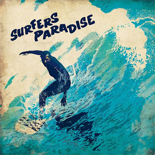
Chris Ede is a illustrator artist who has done many art pieces which include doing some surfing related ones. As shown above, he has inspired my final design with the use of texture and colour variation but something that still reflects surfing.For example: he has used different shades of blue to recreated how the water was when the picture was taken.